
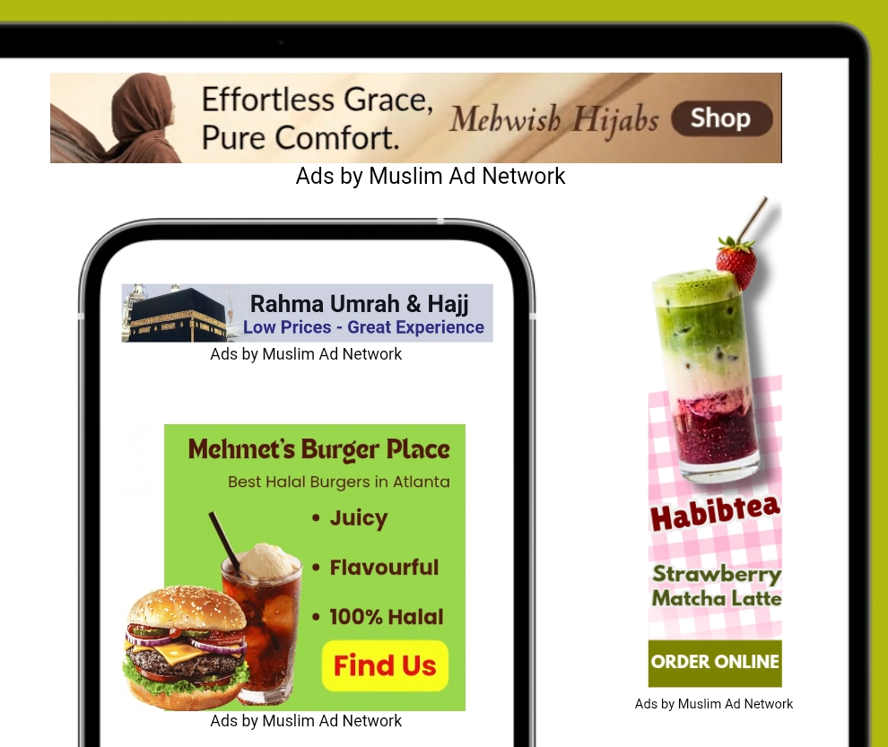
Most of our advertisers move through campaign setup without a hitch. They pick their audience, lock in their targeting, choose their package, and then hit the exact same wall every single time: the creative. Suddenly, format specs, size requirements, and messaging rules feel like their own small industry. It's usually the point where things stall.
When advertisers need a hand, our team steps in to handle the full creative creation to submission process directly.
But handling it for you shouldn't mean keeping the reasoning behind it locked away. Whether you design your own banners, brief someone else to, or just want to understand why certain sizes and formats get chosen the way they do, the knowledge shouldn't be limited to the people building the ads. So here's exactly how a display banner comes together to actually perform: the sizes that matter, the design choices that work, and the formats you can play with.
Display banner ads are still one of the hardest-working formats in digital advertising, and one of the easiest to get wrong. A banner isn't just a small picture with your logo on it. It's a five-second pitch that has to say the right thing, in the right shape, to the right person, before they scroll past it. Get the size, the message, and the visual working together, and a banner can carry an entire campaign. Get it wrong, and even a big budget won't save it.
Here's how to think about display banners so they actually convert attention into results.
Start With Your KPI, Not With the Design
Before a single pixel gets designed, you need to know what the ad is for. That answer changes everything about how it should look and read.
Brand awareness campaigns need visuals and messaging that stick: bold product shots, a memorable line, strong brand colors. The goal is recall, not an immediate click.
Conversion campaigns need urgency and clarity: a clear offer, a strong CTA, and a visual that makes the value obvious in an instant.
The same product can need two completely different banners depending on which of these two goals it's serving. Design without knowing the KPI first, and you end up with an ad that's trying to do both jobs and doing neither well.
Size Isn't Just a Spec. It's a Strategy
Every banner size has a different job because every size lives in a different kind of placement. The size determines how much space you get, how it competes for attention, and how much of your message can realistically survive.
Out of all the IAB standard sizes available, four dominate actual ad placements because they're the ones publishers overwhelmingly support:
On mobile:
320×50 (Mobile Leaderboard): the most commonly placed mobile size. It's tiny, but it shows up everywhere because it's the easiest size for apps and mobile sites to slot in.
300×250 (Medium Rectangle): also huge on mobile, with noticeably more room to work with than the 320×50.
On desktop:
160×600 (Wide Skyscraper): a tall vertical space, usually running down the side of a page.
728×90 (Leaderboard): a wide horizontal banner, usually sitting at the top of a page.
Other IAB sizes like 300×600 Half Page, are worth using where they fit, but these four sizes are where the bulk of real estate, and real attention, is. If you're only going to design a handful of formats well, design these first.
Vertical vs. Horizontal: Space Changes the Message
A vertical placement like 160×600 gives you more room to actually show your product. Use that space: a bigger, clearer product shot earns its keep here.
A small horizontal format like 320×50 doesn't have that luxury. You don't need, and shouldn't try, to fit the whole product in. Pick the single best visual of the product, keep a small CTA in the header or on a button, and let the shape do the work instead of the detail.
Thin Doesn't Mean Weak
Qatar Airways is a good example of this. On the pitch-side perimeter boards during the FIFA World Cup, the space available was extremely limited: just a narrow strip running along the edge of the pitch, with no room for a full scene or a tagline. Their rotation on that strip included a plane taking off, animated, alongside their name in clean, bold typography. No cabin details, no route map, no list of destinations; just the single most captivating moment of the product (a plane lifting off) paired with the brand name, and nothing else competing for space.
That's the move worth copying on any thin format: logo plus the single best view of the product, not the whole product. A plane taking off says "airline" instantly, the same way one clean close-up of a shoe, a dish, or a device says everything it needs to in a 320×50. You don't need the full product story to fit; you need the one visual that makes the product recognizable at a glance, paired with a logo that makes the brand recognizable at the same glance.
That's the same logic behind a thin digital banner. It isn't a compromise. It lives inside something the viewer is already engaged with (an article, an app, a scoreboard, a stadium wall) and only needs to land a flash of recognition: a logo, the single best view of the product, maybe one line, whichever combination the space actually allows. Judged by how much information it can hold, a thin format looks weak. Judged by how much attention it can grab in an instant inside an engaging environment, it's one of the most powerful formats there is.
The Ad Is Not a Manual
This is the mistake that kills more banners than bad design ever does: treating the ad like an information board.
A banner's only job is to earn attention and a click. It is not the place to explain your whole company, list every feature, or answer every question. If you try to cram it all in, the ad stops being an ad; it starts looking like a spec sheet, and people scroll past spec sheets.
Save the full story for the landing page. That's exactly what the landing page is for: once someone clicks because the banner caught their eye, then they get the details, the features, the proof points, everything. The banner's only job is to make them want to click.
The Three Pillars of a High-Performing Banner
The best-performing banners consistently nail three things:
1. Typography (readability first)
Text has to be instantly legible. No jammed layouts, no overly stylized or italic fonts that slow the reader down. Go minimal, modern, and clean, and the smaller the ad, the shorter the copy needs to be. On a 320×50, you might only have room for a handful of words. Use them well.
Contrast matters just as much as the words themselves. Check the background before placing text on it: a light or white image behind white text, or a dark visual behind dark text, will make the message disappear no matter how good the copy is. Pick a text color that stands out clearly against whatever is behind it, and add a solid color block or subtle shadow if the background is busy. Readability isn't optional, it's the whole point of the text being there.
The same goes for the CTA button. Keep it bright and high contrast against the rest of the creative, with button text that's just as legible as everything else. A CTA nobody can read, or one that blends into the background, is a wasted click.
2. Imagery
The product needs to be visible and to look good, not squeezed in as an afterthought. On bigger formats, this is where you can get genuinely creative: interesting effects, lifestyle context, a bolder crop. On smaller formats, pick one strong visual moment rather than trying to show the whole product.
3. Clean composition
The best banners break down into a few simple building blocks:
A header with the hook or CTA
Main text that says what the ad is actually about
A visual of the product
Your logo, placed small and clean so the brand stays recognizable
Nothing messy, nothing overlapping, nothing competing for the eye. If a viewer can't tell what the ad is about in under two seconds, the composition needs to be simpler, not more detailed. The logo matters even when space is tight; it's often the one thing that carries over into brand recall, especially on awareness campaigns.
A Size-by-Size Creative Playbook
320×50: the trickiest, but the most valuable
This size gets the most views and clicks simply because it's the easiest for sites and apps to place; it has the most available inventory of any format. That makes it worth getting right, even though it's the hardest to design for. Keep it extremely lean: a lure line, a small CTA or button, and one strong product visual or effect. This is not the place for a mini paragraph.
Some of the best-performing 320×50 creatives skip text almost entirely: just a clean, tight close-up of the product and nothing else. It's a good reminder that this size doesn't have a fixed formula. Running a text-heavy version against a visual-only version is a simple, low-cost way to test which one actually performs better with your audience, rather than assuming one style always wins.
300×250: more room, more story, still disciplined
You can add more here, a bit more information, a bit more visual detail, but "more room" doesn't mean "more clutter." Use a nice background, let the product and message breathe, and stay creative rather than crowding the space.
160×600: same principles, bigger canvas
The wide skyscraper follows the same logic as the 300×250, just with more vertical space to play with. Use the extra height to give the product visual more presence.
728×90: width to tell a bit more of the story
More horizontal space means more room for message, but the same clean, uncluttered approach still applies. Resist the temptation to fill the extra width just because it's there.
Get Creative, Especially When You Have the Space


The bigger the format, the more room you have to be bold: unique visual treatments, product effects, unconventional layouts. The more distinctive and creative the ad looks, the more attention it earns, and attention is the entire currency of display advertising. Just keep the core discipline intact: readable text, a visible product, and a clean structure, no matter how much creative flourish you add on top.
File Formats: PNG, JPG, GIF, HTML5, and Dynamic Creative
A banner isn't limited to a single static image. Knowing when to reach for each format matters as much as picking the right size:
PNG / JPG / JPEG: static images, and still the most reliable, widely-supported option. Simple, lightweight, and perfect for a clean product shot with no moving parts.
GIF: adds lightweight motion, a subtle loop, a product rotating, an offer changing across a couple of frames. It's an easy way to bring in movement without a full production.
HTML5: the richest format available in a standard banner slot. It supports animation, interactivity, and rich media, and it's the closest thing to a video experience you'll get in display advertising.
Dynamic Creative (DCO): instead of uploading one finished banner, you upload individual pieces like building blocks (a few headlines, images, and CTA buttons). Modern ad platforms then automatically mix and match these pieces in real-time, serving the best-performing combination to each viewer automatically.
Video isn't always an option for display: plenty of placements don't support it, and even when they do, full video production isn't always worth the cost for a banner buy. This is exactly where GIF, HTML5, and Dynamic formats earn their place: they let you bring in motion, flexibility, and richer storytelling in place of video, at a fraction of the cost and without the placement restrictions video often runs into.
Quick Takeaways
Design to the KPI first: awareness and conversion need different banners.
Prioritize 320×50 and 300×250 for mobile, 160×600 and 728×90 for desktop; these dominate real placements.
Vertical formats: show more product. Small horizontal formats: show less, better.
Thin formats aren't weak: like a stadium board or billboard, they only need a logo, one visual, and one line to land inside an already engaging placement.
An ad is not a manual; save full details for the landing page.
Every banner should nail four things: readable typography, strong imagery, clean composition, and a visible logo.
Scale ambition with size: minimal and lean on 320×50, progressively more room to tell the story as formats get bigger.
Don't assume text is required: a text-free 320×50 with a strong product close-up is worth testing against your text version.
Never let text or the CTA button blend into the background; keep contrast strong so everything stays readable at a glance.
Static isn't the only option: use GIF, HTML5, or Dynamic Creative to add motion, customization, and rich media where video isn't practical or affordable.
Don't let creative specs stall your next launch. Visit here to start your campaign or reach out to our team. We'll help you turn attention into real results.
Email us sales@muslimadnetwork.com